Book cover design tips for self-publishers
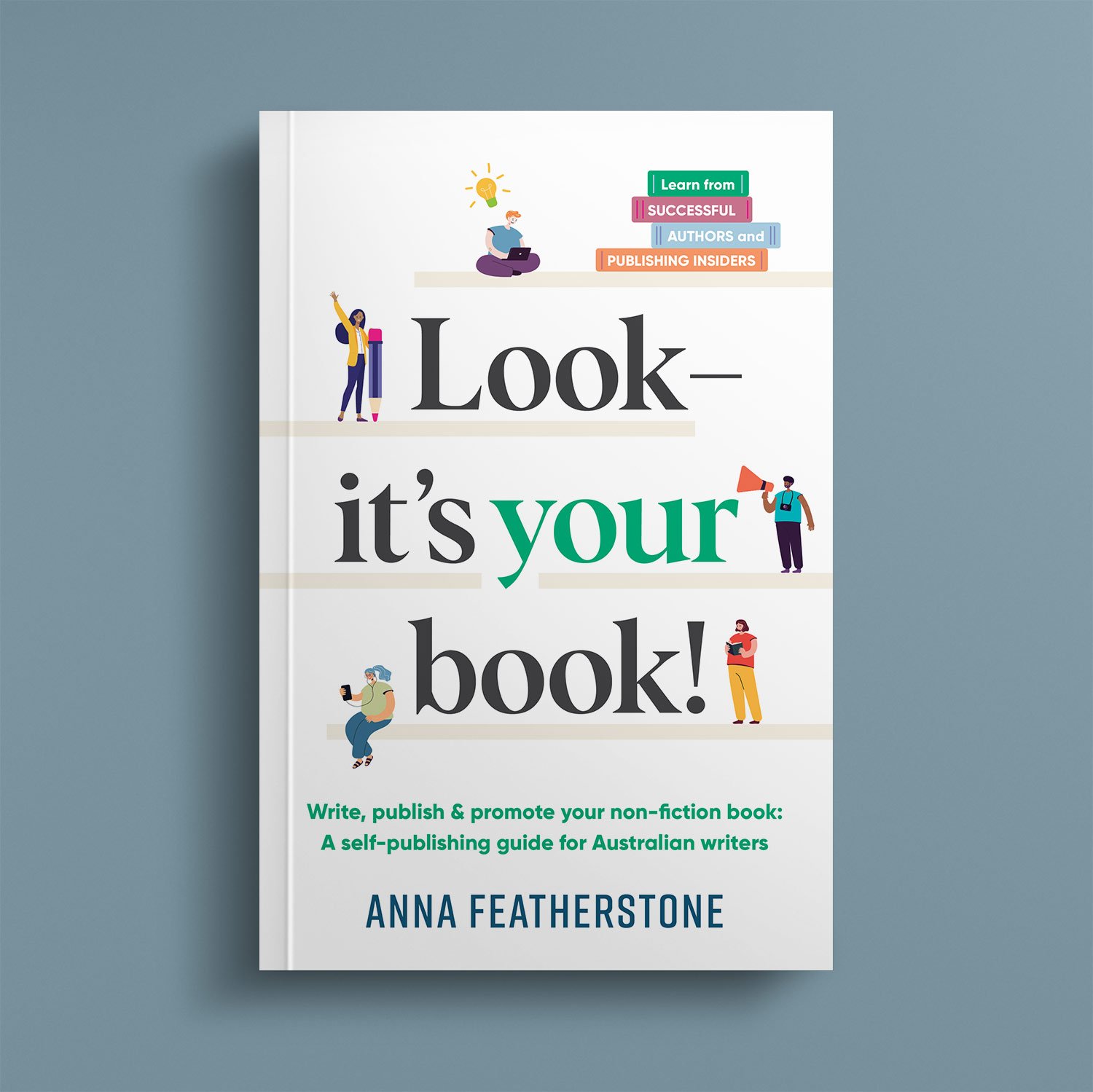
In 2021, writer and independent publisher Anna Featherstone got in touch to interview me for her non-fiction title Look – It’s Your Book! A self-publishing guide for Australian writers. The book is a must-have resource for any Australian writer who wants to see their non-fiction book on the shelves of Amazon, traditional retail, and into the libraries of readers everywhere.
I was thrilled to be asked to offer my tips on cover design for self-published books. The interview in full, republished with permission, is below. (Oh, and PS – I also designed the cover of the book!)
What are your top tips for self-publishers when it comes to book design/working with book designers?
Collect reference material of designs that you like, imagery and so forth, but also note the feel of the paper stock and cover texture of books you like. Usually, if you look inside a book at the imprint page (where the copyright information is listed), it will list the printer's name. That can be a useful start to getting a book of a similar quality produced for your own title.
What is the key information you need from an author before you begin a book cover and/or interior design?
A close-to-finished manuscript is ideal. I love to see a collection of visual images that the author has collected, not just cover designs they like, but colour palettes, artworks, signage and the like that speaks to them.
What common misconceptions do authors have when it comes to book cover and/or interior design?
That it's not just customers, but book retailers who will judge a self-published book by its cover. In a retail environment you're competing with established publishers who invest a lot of time and effort to make a beautiful book, so less-professional designs stand out. When you're flying solo, a book's design can be the thing that makes or breaks your entry into traditional retail.
Also, it might seem obvious, but the book title and subtitle aren't just words on a page but oftentimes can be an intrinsic detail of the book cover's design – so to change the title or subtitle after the book cover design has started (or is nearly complete) can have a domino effect resulting in a less-impactful cover.
How long does the book cover design process take?
Anywhere from a week for just a front cover, to several months for the full book design and layout process (with rounds of edits included). I should note, that's not me working 'full time' on one book: I work on projects for multiple clients at the same time, and I am often unable to begin something new for at least a few weeks after the client has approved my proposal. All this to say: the more time you have for the design phase, the better, especially if you're working with someone with experience and in high demand.
What are some of the key things you wish authors knew about book design?
That the process isn't just about putting the author's images and words into a file format that is acceptable for a printer. So much of the graphic design process is about understanding the author, understanding the book's content, understanding the target market, research, trying out ideas so see what works in practice. Plus there is our intimate understanding of the power of typefaces (and which ones will/won't give your readers a headache after the first chapter).
How do you like to work with a client – are there any particular steps you take throughout the process?
I always start with a questionnaire which helps to get the creative brief in place, and if there aren't many visual references to ascertain the aesthetic direction of the book, some mood boards might also be developed to help this. Then I design a variety of covers based on the brief/aesthetic direction and we work collaboratively to narrow down the options from there. The internal design (if it's quite a simple non-fiction book) the back cover and the spine are completed later in the process, usually towards the end of the book design.
Have you any interesting stories (positive or negative) you can share about book cover design?

The cover design for the Conversations with Creative Women series
I self-published a series of three books called Conversations with Creative Women. The cover design for each of the books probably goes against modern conventions because the title is quite small, and there's not really a blurb on the back or any stand-out graphics. But the thing that makes them successful in terms of design is that each one is a single bold colour, and those colours look great together. I think it's the reason they are almost always on prominent display together at the retail outlets they are stocked (including the gift stores in almost all the state Art Galleries and museums, and major independent book retailers). They work well in visual merchandising. Titles don't have to be large or flashy to be attractive to booksellers or customers.

If you’re thinking of publishing your own book, I hope this information about hiring a cover designer assists you in the process. And don’t forget to check out Look – It’s Your Book, available at all good book retailers and via Anna’s own website.